If You Can’t See It, Your Phone Can’t Scan It
QR codes look simple on the surface. A square, some dots, three corner markers, maybe a logo. But the moment you customize one—colors, shapes, backgrounds, frames—the scanability can change fast. A QR code is both a design element and a functional piece of technology. If either part fails, the entire experience fails.
Most people think a QR code either works or doesn’t. In reality, there’s a huge area in between. You can create QR codes that technically work, but scan slowly, only under good lighting, only with some phones, or only when the user aims perfectly. That’s where the design becomes critical. The more effort you put into making it readable, clear, and visually intentional, the better the results.
A great-looking QR code can increase scans, trust, and engagement. A poor design can destroy them.
This guide explains why QR code design matters, what affects scanability, and how to create codes that look good without breaking functionality.
1. The Real Reason QR Code Design Matters
A QR code works only when the camera clearly sees the contrast and patterns needed to decode the information. Your design choices either help that process or block it.
If your phone can’t instantly read the code, the user won’t bother. That’s why design matters: scanability equals usability.
Here are the factors that influence whether a QR code scans:
• Contrast between foreground and background
• Shape and clarity of the modules (dots)
• Visibility of the three corner “eyes”
• Interference from logos or images
• Overlays, patterns, or background textures
• Size and distance from the user
• Placement in real-world environments
Every choice you make either strengthens or weakens these elements.
A QR code that looks great but scans poorly is a failed design.
2. High Contrast Is the Foundation
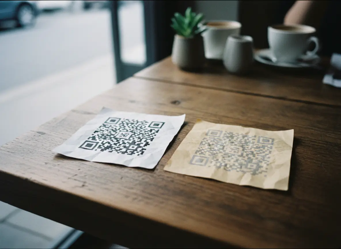
Contrast is the number one factor. QR codes rely on detecting differences between dark areas and light areas.
High contrast is not optional. It’s the foundation.
The safest choice
• Dark foreground (black or deep colors)
• Light background (white or pale colors)
What hurts scanability
• Light-on-light combinations
• Fancy gradients with low separation
• Dark backgrounds with dark QR modules
• Busy images behind the QR pattern
• Low opacity foreground colors
Designers often want creativity, but creativity can’t reduce function. If the camera can’t detect contrast instantly, the code won’t scan. And users won’t give it a second try.
3. Shapes Matter More Than You Think
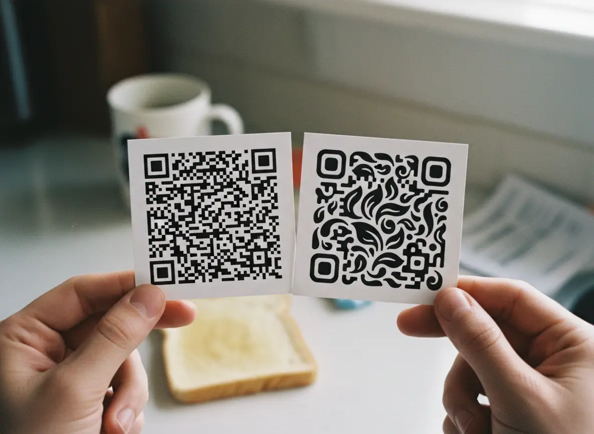
Changing the shape of the QR modules can make your code look modern and branded. But shapes that are too soft, thin, or decorative can reduce readability.
Phones rely on:
• Sharp edges
• Clear separation
• Consistent geometry
When shapes become too abstract—stars, hearts, droplets, diamonds—the pattern recognition system has more work to do. These shapes still work, but they’re less forgiving in low light or from a distance.
Safe shapes
• Squares
• Circles
• Rounded squares
• Clean geometric shapes
Riskier shapes
• Stars
• Hearts
• Irregular or twisted shapes
• Very thin or elongated shapes
The rule is simple: choose designs that still look like a clear pattern of solid, separate shapes.
4. The Corner Eyes Are Non-Negotiable
Those three little squares in the corners are what help the scanner orient the code. They’re like the “north, south, east” of the QR world.
Customizing the eyes is fine, but only if they stay:
• High contrast
• Clearly visible
• Fat enough to be recognized instantly
• Not covered by logos or patterns
If the eyes fade into the background or blend into your design, scanning becomes slower or fails entirely.
Think of them as anchors. The camera depends on them. Your design should protect them, not hide them.
5. Logos Are Great—Until They Aren’t
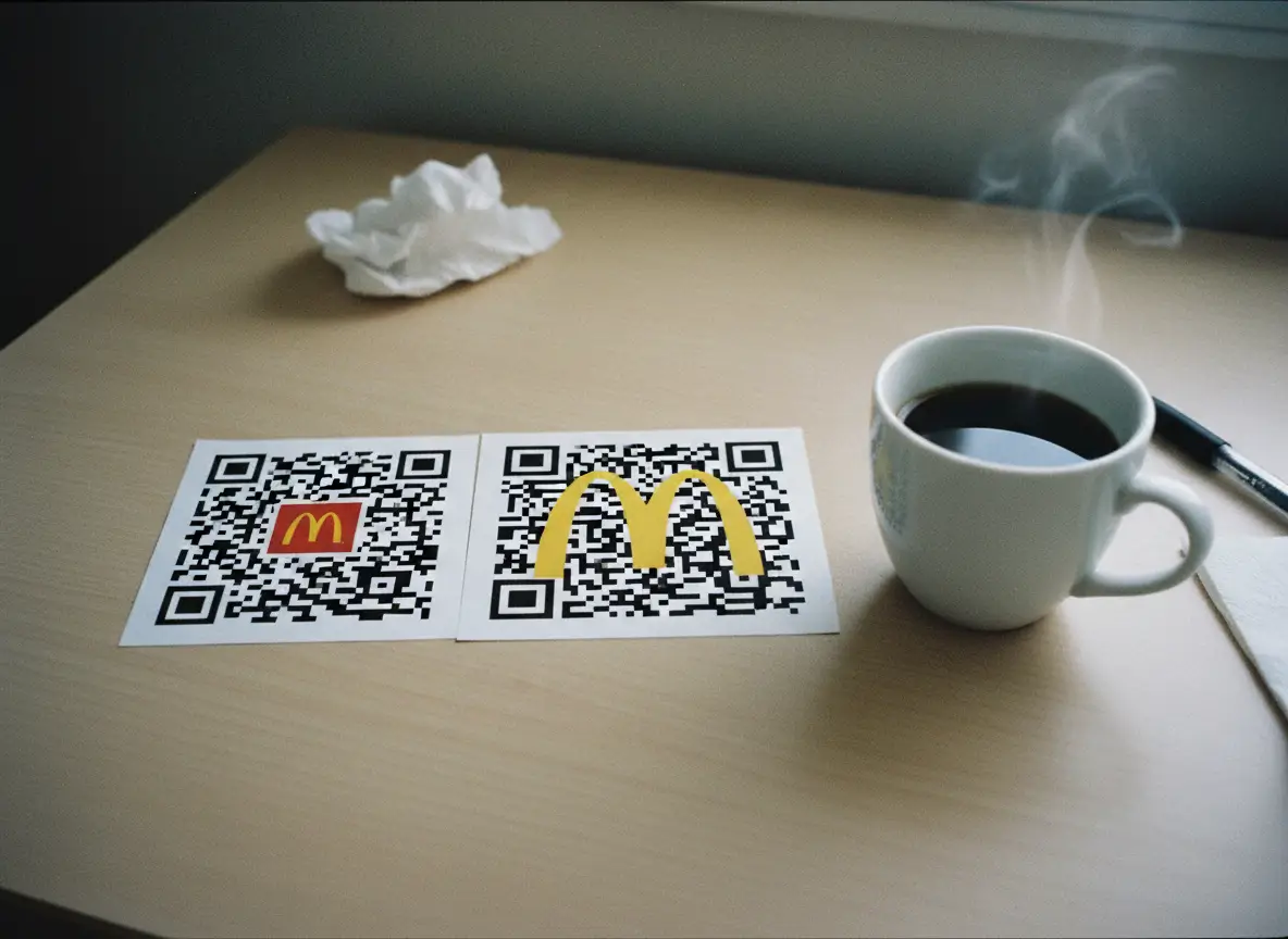
Adding a logo is one of the best ways to brand your QR code and increase trust. People scan branded codes more often because they feel safe.
But logos also introduce risk.
Problems caused by oversized logos
• They block too many modules
• They cover the center alignment pattern
• They break the symmetry of the code
• They reduce available scan area
Phones can correct for a lot, but not everything. A centered logo works best when it’s:
• Small to medium size
• High transparency or clean edges
• Placed without overlapping crucial markers
A huge opaque logo in the middle is the fastest way to create a QR code that only works when you’re lucky.
6. Background Images Need Discipline

Background images look great—until they clash with the QR pattern.
A busy background makes scanning much harder. QR codes should be readable first, beautiful second.
When using a background:
• Lower the opacity
• Use light textures rather than heavy details
• Avoid complex photographs
• Maintain strong contrast
• Keep the background predictable and soft
Think minimal, not chaotic. The QR pattern must stay visually dominant.
7. Frames Improve Clarity and Boost Scans
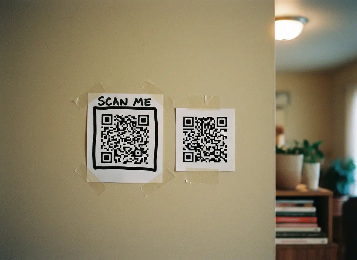
Frames can dramatically improve scan rates because they draw attention and give context.
A QR code without context looks like decoration. A frame with text immediately communicates purpose.
Examples:
• “Scan for Menu”
• “Book Now”
• “Order Here”
• “Visit Website”
• “Special Offer”
Frames also help the QR code stand out on printed materials by providing:
• Borders
• Padding
• Space
• Visual separation from background
If you want more people to scan your codes, frames are one of the simplest upgrades.
8. Size and Placement Matter in the Real World
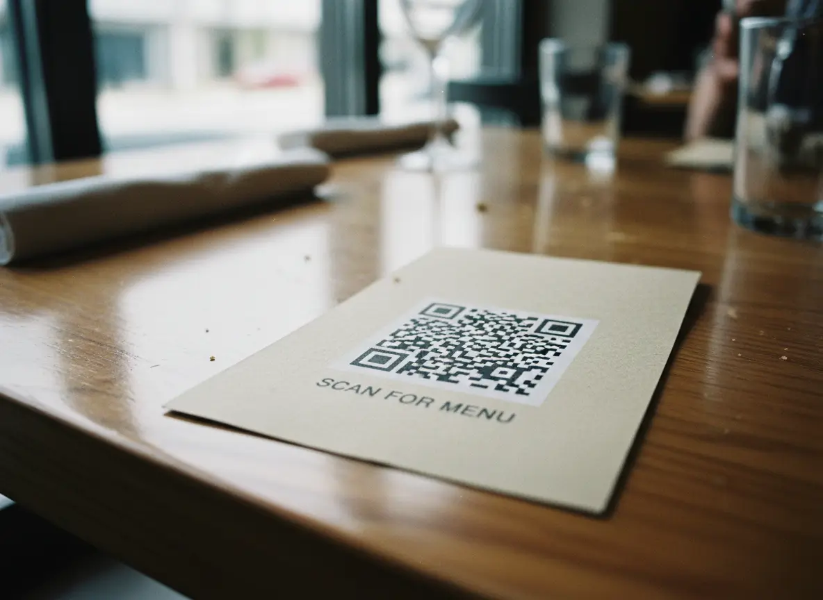
Design isn’t just visual—it’s practical.
Size
A QR code should generally be:
• Minimum 2 cm x 2 cm for close scans
• Larger for posters, walls, or distance scans
• Scaled based on real-world use
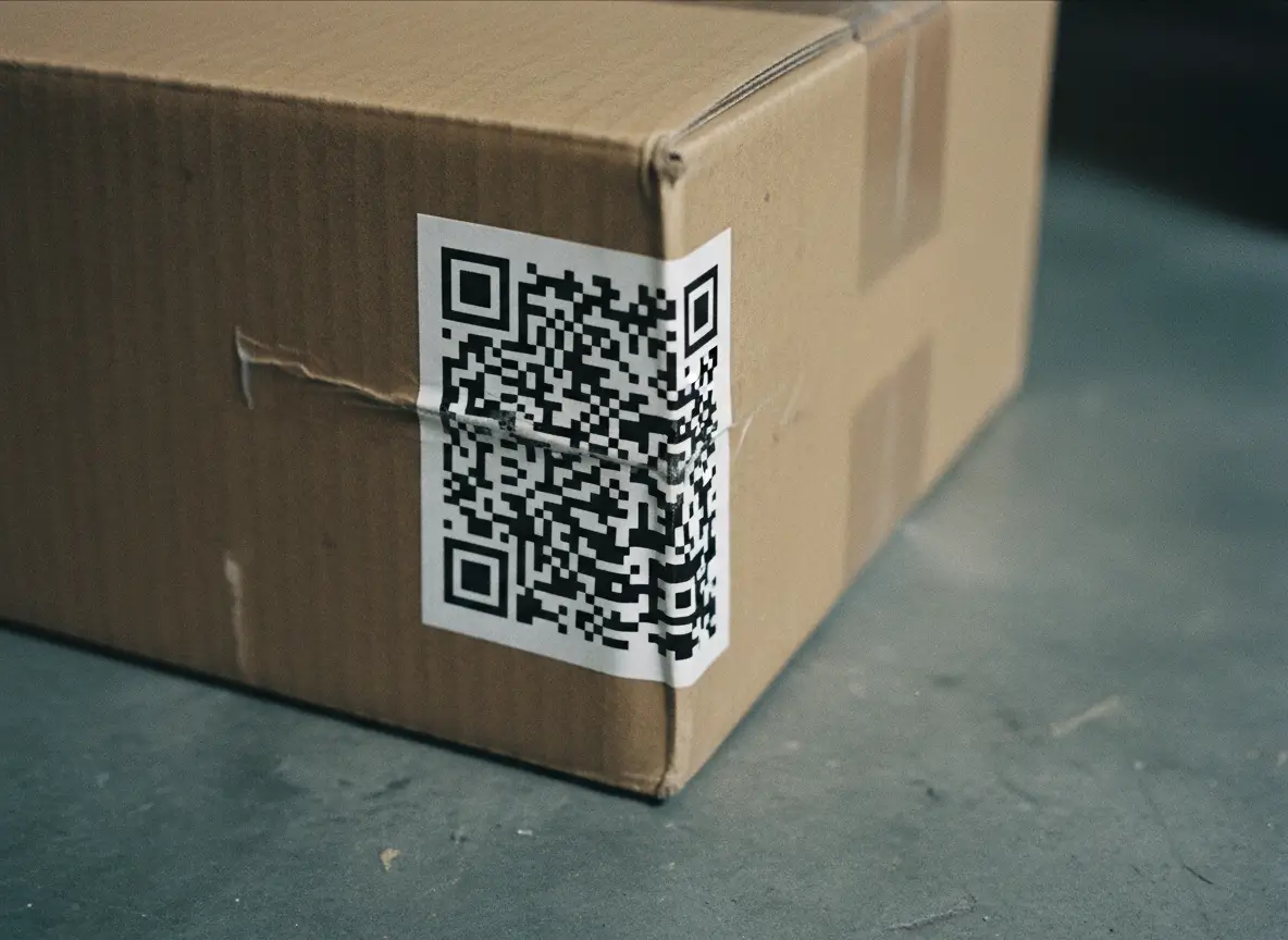
Tiny QR codes on packaging often fail unless the phone is extremely close.
Placement
Bad placements include:
• Curved surfaces
• Dark corners
• Wrinkled packaging
• Moving objects
• Areas with glare
• Low-light environments
Place codes where they’re easy to see, with good lighting and a flat surface.
If users struggle to see the code, they won’t scan it.
9. Testing Is Not Optional
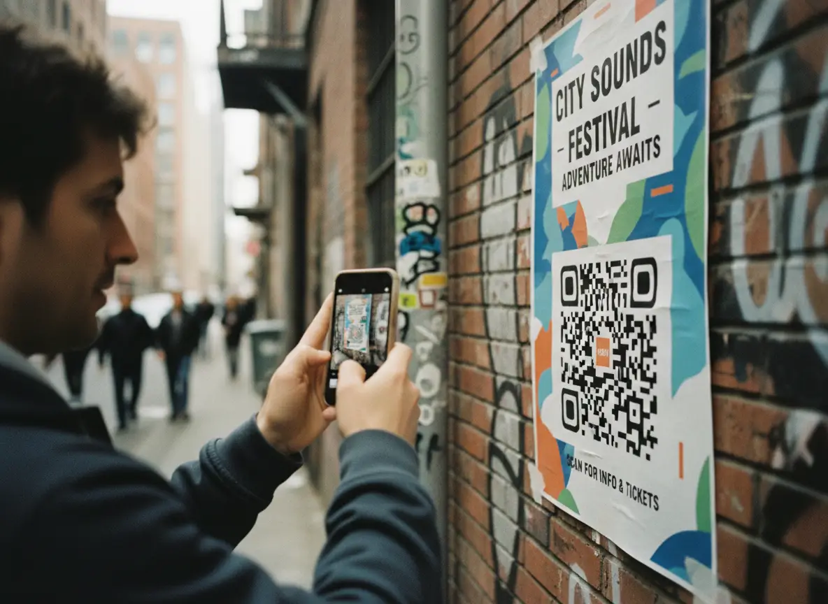
This is the part people skip—and the part that causes the most headaches.
Before finalizing a design, test your QR code on:
• iPhone and Android
• Older devices
• Bright lighting and dim lighting
• Different distances
• Different angles
• Printed and digital versions
A QR code that works perfectly on your monitor may fail miserably when printed on glossy paper.
Scan it yourself. Ask someone else to scan it. Test it on a real poster or menu.
Testing takes 30 seconds and saves hours of reprints.
10. Consistency Builds Trust
A consistent QR style helps your brand:
• Look professional
• Build familiarity
• Increase repeat scans
• Reduce confusion
When customers see the same design across menus, posters, stickers, receipts, packaging, and your storefront, they trust it.
A random set of different QR styles makes you look disorganized. Keep one style template and repeat it across your materials.
11. A Good Design Makes Scanning Automatic
Here’s the truth: customers won’t fight with your QR code. If it doesn’t scan instantly, they stop trying. People expect a QR code to work the moment they point their phone at it.
A well-designed QR code:
• Pops visually
• Scans instantly
• Works in low light
• Works from different angles
• Scans even when partially damaged
• Feels intentional and trustworthy
That’s the standard you should aim for.
12. Tips for Designing High-Performance QR Codes

Keep these practical rules in mind:
- Use high contrast (dark foreground on light background)
- Choose readable shapes—avoid thin or overly decorative patterns
- Keep logos small and centered
- Preserve the clarity of the corner eyes
- Use backgrounds carefully with transparency
- Add a frame and clear text when possible
- Avoid cluttered environments
- Print at realistic sizes for real-world scanning
- Test before publishing
- Keep a consistent style across your brand
Follow these steps and your QR codes will perform better everywhere.
Designing a QR code is not just about making it look good. It’s about making it instantly scannable in the real world. The right design boosts trust, increases engagement, and ensures people can access your content without friction.
The principle is simple:
If you can’t see it clearly, your phone can’t scan it.
Good design protects functionality. Great design enhances it. When you combine both, you get a QR code that’s easy to scan, easy to trust, and easy for customers to interact with.
